

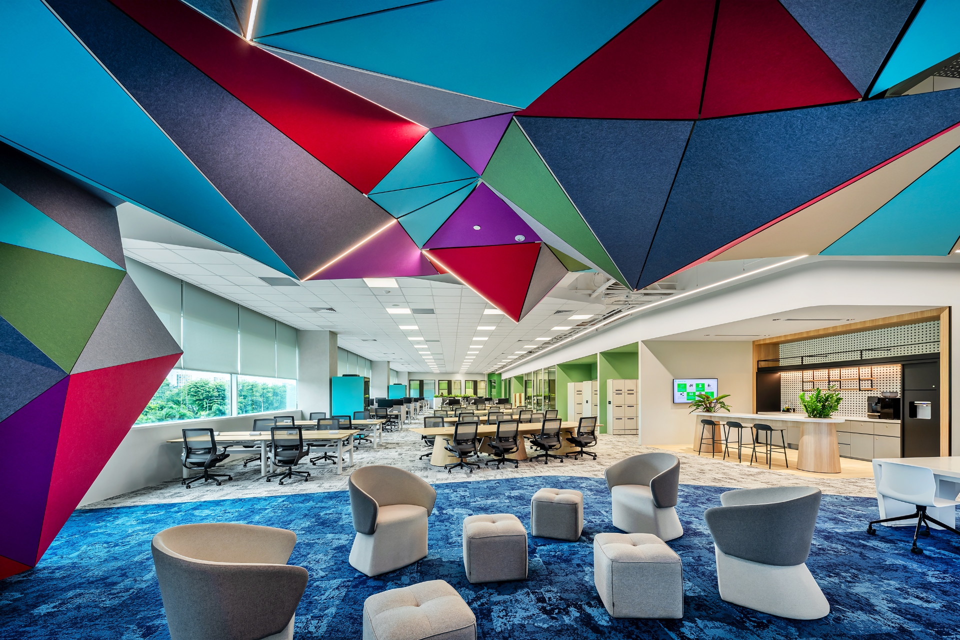
Color: The Silent Influence on Performance
Walk into any office and color is everywhere—walls, furniture, flooring, artwork, branding elements. Yet most companies choose colors based on aesthetics or brand guidelines without considering psychological and productivity impacts.
Research consistently demonstrates color profoundly affects mood and emotional state, cognitive performance, energy levels, stress response, and even physical comfort (color influences perceived temperature).
Studies show appropriate office colors can improve productivity 5-12%, reduce errors, enhance creativity, and boost employee satisfaction. Wrong colors create opposite effects—fatigue, irritability, reduced focus, and increased stress.
After designing 500+ offices across Asia with intentional color strategies, we've learned which colors work for different functions, how to balance psychology with aesthetics, and what works in different cultural contexts.
This comprehensive guide provides evidence-based framework for selecting office colors maximizing productivity, wellbeing, and visual appeal.
The Psychology of Color: What Research Shows
Blue: The Productivity Champion
Research findings: Enhances focus and concentration, reduces stress and anxiety, promotes calm efficiency, and improves cognitive performance on detail-oriented tasks.
Best for: Offices requiring sustained focus (accounting, data analysis, programming), environments where stress reduction important, and conservative professional settings.
Caution: Too much blue can feel cold or depressing. Balance with warmer accents.
Application: Walls in focus work areas, accent walls in meeting rooms, and subtle undertones in neutral schemes.
Green: The Balanced Performer
Research findings: Reduces eye strain (easiest color for eyes to process), promotes sense of calm and balance, enhances creativity and innovation, and connects to nature (biophilic benefit).
Best for: Spaces requiring long screen time, creative work environments, wellness-focused companies, and any space seeking natural, refreshing feel.
Application: Accent walls, plants (living green), furniture accents, and artwork themes.
Yellow: The Energy Booster
Research findings: Stimulates optimism and positivity, boosts energy and alertness, enhances creativity, and promotes communication and social interaction.
Best for: Collaboration spaces, creative studios, break rooms and social areas, and spaces lacking natural light.
Caution: Intense yellow can cause anxiety or eye strain. Use in moderation as accents.
Application: Accent walls in collaboration zones, furniture pieces, artwork, and decorative elements.
Red: The Attention Grabber
Research findings: Increases heart rate and alertness, stimulates urgency and action, enhances physical performance, and draws attention.
Best for: High-energy environments, areas requiring quick decision-making, accent in sales/marketing spaces, and emergency/warning applications.
Caution: Too much red increases stress and aggression. Use sparingly.
Application: Small accent walls, feature furniture, brand elements, and directional/safety signage.
Orange: The Social Connector
Research findings: Promotes enthusiasm and excitement, facilitates social interaction, stimulates appetite (pantry application), and balances energy with warmth.
Best for: Break rooms and pantries, collaboration spaces, creative agencies, and areas promoting team bonding.
Application: Accent walls in social spaces, furniture in breakout areas, and artwork/graphics.
White/Neutral: The Clean Slate
Research findings: Creates sense of space and cleanliness, promotes clarity and organization, provides backdrop for other colors, and reflects maximum light.
Best for: Small spaces (makes them feel larger), minimalist/modern aesthetics, technology companies, and healthcare/laboratory settings.
Caution: Pure white can feel sterile or institutional. Warm off-whites preferred.
Application: Primary wall color with accent color strategy, ceilings, and trim/details.
Gray: The Sophisticated Neutral
Research findings: Projects professionalism and sophistication, works well in contemporary design, doesn't distract, and provides excellent backdrop.
Best for: Corporate offices, financial services, professional services, and modern tech companies.
Caution: Too much gray feels depressing. Use with color accents.
Application: Neutral base with colorful accents, feature walls (dark gray), and furniture tones.
Color Combinations That Work
The 60-30-10 Rule:
Professional color scheme formula:
- 60%: Dominant color (usually neutral—white, beige, light gray)
- 30%: Secondary color (brand color or complementary neutral)
- 10%: Accent color (bold color for visual interest)
- Base: White and light gray (60%)
- Secondary: Blue (30%)
- Accent: Orange or yellow (10%)
- Base: Warm white and beige (60%)
- Secondary: Navy blue or charcoal gray (30%)
- Accent: Gold or burgundy (10%)
- Base: White (60%)
- Secondary: Teal or emerald (30%)
- Accent: Coral or mustard (10%)
- Base: Soft white (60%)
- Secondary: Sage green (30%)
- Accent: Lavender or soft blue (10%)
- Base: Light gray (60%)
- Secondary: Navy blue (30%)
- Accent: Burgundy or forest green (10%)
- What's primary office function? (focus work, collaboration, creativity)
- What feeling should space evoke?
- What's brand identity?
- What's cultural context?
- Select base neutral (60%)
- Choose complementary secondary (30%)
- Add strategic accent (10%)
- Test samples in actual lighting
- Not every wall needs color
- Feature walls in strategic locations
- Use furniture and accessories for accents
- Consider ceiling (often overlooked)
- Too much color overwhelms
- Too little is boring
- Variety across spaces (meeting rooms can differ from workstations)
- How do you feel about office colors?
- Do colors support your work?
- Energy levels throughout day?
- Pre/post color change comparison
- Error rates
- Project completion times


